Metallica Logo - Most Recognizable Metal Logo Ever Existed?
When it comes to rock, it's much more than just music. It's a lifestyle with its own fashion. Over the years, rock & metal music has separated itself from the rest of the world not only with its irresistible energy but also with the visuals the culture has developed. Logos, album art, and graphics have been unifying parts of this culture and have influenced the entire world with these designs. In the spirit of our modern era, we see metal culture exceed every limit possible, with non-metal celebrities wearing old-school Metallica, Megadeth, Iron Maiden, Slayer, and Cradle of Filth t-shirts, and established clothing brands selling metal band merchandise as part of their collections.
Bands that started in the '70s and '80s were the pioneers of a tremendous wave of this new culture, and it dominated the entire planet within just a few years. Genres of rock and roll reached their peak while touring the world, with millions of people coming to their live shows. Among all the important metal pioneers from those times, one of the significant names was Metallica, who made the biggest impact with their image, music, marketing strategy, and of course, their branding. The Metallica logo has undoubtedly become the logo of metal itself.
Origins of the Metallica logo
According to graphic design experts, creating a memorable and easy-to-identify logo is not a task that everyone can achieve. It's challenging to design a logo that stands out but also has the simplicity needed to draw in as many people as possible. However, the origin of Metallica's iconic logo is much simpler than you might think. The band did not hire a graphic design expert who understood all the ins and outs of logo design; instead, the artistic mastermind of this story was James Hetfield.
James confessed in an interview that he was the creator of the iconic logo by which the band is recognized in every corner of the world. He added that during his time in high school, he studied drawing for a few years.
This experience meant that the creation of the logo was not a problem for him. So, in a sketch, he was able to capture the idea he had. This idea would later become the hallmark of a band that was preparing to become the biggest metal band in history and also serve as a reference for other great artists that would emerge later.
Chronology of Metallica logos
Although Metallica has remained faithful to its initial "classic" logo, it has not always been the only one. Throughout its almost 40-year career, there have only been four logos that accompanied the band in its various musical works.
The Beginning and the First Official Release: 'Kill 'Em All' (1983)
Since their debut in 1981, Metallica began to use the logo created by James Hetfield, which has become the distinctive image not only of the band but has also become the first thing that comes to mind for many when they think of metal music. This logo is quite simple, but the letters “M” and “A” have a more elongated look than the rest of the letters. The other letters are also slightly crooked. For almost 10 years, this was the image that accompanied many of their albums and became popular all over the world. In fact, those who are not expert Metallica fans could assert that this is the only metal band logo they know. This logo can be seen on Metallica’s Kill 'em All album where the typography of the lettering is sans-serif, at least in the central letters. We also know that at the beginning and the end there are elongated and stylized letters.
'Ride the Lightning' - 1984
For Ride the Lightning, Metallica had not only evolved with their sound, but they also managed to show this evolution in their visuals. This time, the album presented a slightly different image than what we had seen before. The cover graphic now displayed Metallica’s name in three dimensions. The depth was noticeable and the logo fit very well with the iconic artwork of the Ride the Lightning album.
'Master of Puppets' - 1986
In this year, Metallica again made subtle changes to their logo on their third studio album, presenting it in their Master of Puppets album. The three-dimensional shape seemed to please everyone, so it was retained, but this time with a paler color, exactly matching the tombstones in the cemetery depicted on the cover.
'Garage Days' - 1987
Garage Days Re-Revisited was released in this year, and the logo was relatively simple compared to its predecessors. It was created using simple but highly recognizable lettering, as it perfectly emulated their typical logo. Although it appears to have been made freehand, that was indeed the case. Its creator, James Hetfield, has said that this is how the band’s logo was born, from a sketch he made with paper and pencil.
'...And Justice For All' - 1988
'...And Justice for All' arrived at the end of 1988, bringing with it some notable changes to the logo. The first thing that could be observed was that they partly abandoned the theme of a three-dimensional logo style used on both 'Ride the Lightning' and 'Master of Puppets' albums. The new logo is not only shown, but it appears as though it was carved out of a stone wall, which blends with the theme of the album.
'Metallica' a.k.a. 'The Black Album' - 1991
When Metallica created 'The Black Album', the theme was reflected on the cover, which was completely black. For their fifth album, Metallica included an almost black logo on a completely black background, so the letters were subtly visible. It was also slightly inclined, about 45°, and it was located in a corner. The difference was essentially in the subtle color distinction and positioning of the logo.
'Load' and 'Reload' Era - 1996 / 1997
1996 was a significant year for all Metallica fans around the world. After taking a five-year-long break after releasing their globally acclaimed self-titled album, Metallica returned as a completely revamped band. They altered their logo once again for their newest album, 'Load', where substantial modifications were noticeable. The typography diverged significantly from the previous one, offering a more subdued and elongated representation of the band’s name. The initial and final letters are slightly more elongated, but not as much as in the previous logos. Just a few points protrude out as the primary differences. As for the lettering's fill, a “noise” style is apparent throughout. This logo was retained for 'Reload', their subsequent album.
'Garage Inc.' - 1998
In 1999, Metallica also embellished their 'The Garage Remains the Same' tour with an ad that featured a relatively simple logo. It was a sort of simplistic and chunky script that referenced their most recognized logo, with the first and last letters extending longer than the rest.
'San Francisco Symphony and Metallica' - 1999
During this year, Metallica embarked on a unique collaboration with the San Francisco Symphony Orchestra. Thanks to this partnership, a new logo was created that symbolized the fusion of both groups. A pair of intertwined letters – the 'M', a characteristic symbol of the metal band, and an 'S' merged with a treble clef – represented the orchestra.
'St. Anger' - 2003
This was probably Metallica's most elaborate logo, as it featured far more detail than its predecessors. An irregular line bordered the band's name, paired with some shadowing, and the logo retained its characteristic elongated letters. However, this time, they offered a simpler framing. Despite being crafted for the 'St. Anger' album, the logo wasn't used on the album cover, which may explain why few remember this era's emblem.
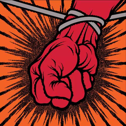
'Death Magnetic' - 2008
The studio tasked with creating this logo, or rather refining it, was Turner Duckworth. The design paid homage to James' original concept, yet it incorporated small details that added a touch of sophistication. First seen on the 'Death Magnetic' album, the logo seemed destined for longevity. As anticipated, this emblem was not accompanied by graphics but retained the band's elegant image.
'Hardwired... To Self-Destruct' - 2016
For 'Hardwired… To Self-Destruct', a variant of the previous logo was used, with only the upper half being slightly offset from the lower half. The change was subtle, yet noticeable.
How Did Metallica Make Such a Big Impact with Their Logo Since Their Very First Show?
To understand why this logo became one of the most popular since its creation until today, it is necessary to delve a little bit into the time in which this and many other bands of different musical genres emerged. Decades before Metallica existed, many bands had the need to give a little more identity to their image. As graphic designers at that time did not have technological support like the current one, lettering became very fashionable. It was quite usual to see the names of bands written freehand with calligraphy that attracted attention for being quite beautiful and simple. This style of logos became very popular in the pop genre. It was not until the '70s that rock began to be grounded in the music industry. Although lettering was still in force, many bands and artists decided to incorporate some elements of those elements into their logos, such as less curved letters. In fact, these became very pointed and perhaps matched the sounds of electric guitars, which are a characteristic instrument of the genre.
During later years, other genres began to emerge. Thrash and heavy metal dominated the scene, paving the way for the biggest bands to become known, and Metallica was one of these bands. By the '80s, young people felt much more identified with different musical genres, so the trend of wearing t-shirts with printed logos of their favorite bands became very popular. From that moment on, many bands felt the need to create original logos that could appeal to their fans and be easily recognizable at the same time.
Although the creator and frontman of Metallica did not give a specific reason to explain the origin of the band’s logo, it is evident that, like most bands at that time, he wanted his design to be easy to recognize while being able to encapsulate a bit of what metal was at that time. The band's name, coupled with their powerful sound, made the design very well-received. This relationship between the logo branding and the music itself made the fans feel proud to belong to this musical movement they identified with.
The 'Classic' Metallica Logo
Perhaps all fans are sentimental towards the older, more classic band logo that helped identify what the band should look and sound like. In the case of Metallica’s logo, it must be said that its original logo from the thrash metal era of Metallica is the one most loved by the public. It is the most recognizable design among the greats of thrash and is undoubtedly the most loved, according to their fans' opinions. Although it has had some minor modifications over time, this was not a problem for their fans, who love to see the logo on many different Metallica articles.
And the Least Liked
In 1996, in relation to the "Load" album, Metallica had the idea of renewing their image. So, they decided to change the style of their logo by creating something completely different from what they had shown the public in the past.
Almost all the letters were the same size, but their typography bore no resemblance to what they had before. According to some fans, this new style was not very well accepted, since they were quite used to the logo that had commonly been modified according to the theme of the previous album covers.
However, although this logo was the one Metallica fans liked the least, it was repeated once again with the release of their next album, "Reload".
After these albums, Metallica made some more changes. It would take years for them to return to the base, the original idea of James. This logo is the one that everyone recognizes Metallica for.
Is Metallica's Logo the Most Recognizable in Metal?
Not only metal aficionados but also individuals outside the genre can readily associate the Metallica logo with the metal genre as a whole. This testament goes beyond mere subjective opinions and finds support in the observations of various experts.
Numerous experts assert that Metallica’s logo embodies several attributes that position it as one of the most recognizable symbols across the globe:
Firstly, its simplicity is a standout feature. The logo eschews intricate designs and concealed meanings, centering solely on the band's name. It isn't burdened with excessive detailing or overdesign.
This simplicity facilitates a vast range of applications. Easily replicable, the logo can be scaled and printed on anything – from stickers and T-shirts to molds on cars or bikes. This accessibility has exponentially increased its marketability.
Moreover, Metallica’s logo isn't visually overwhelming. This clarity and simplicity have played a significant role in making it exceptionally memorable.
Experts also suggest that this type of logo stands the test of time. Despite the changes it has undergone throughout the years, it remains instantly recognizable as Metallica's emblematic symbol, which signifies the band's enduring impact in the music industry.
But, this logo is not only recognized in the music industry
Admittedly, the members of Metallica were very smart to hire Turner Duckworth to work on their design, as this company is known for working with the logos of other big companies such as Coca-Cola and Amazon.
Although, for some people, the company did not significantly modify the original logo, while it is true that they made some slight changes, it has become more attractive. The Metallica logo is distinctive among both connoisseurs and non-connoisseurs of the metal genre.
In fact, after the last change, the band felt grateful, since they know that for their fans it is really important to keep some elements of their past alive and well. These are important elements that fans can identify and remember marked times in their lives.
The first improved prototype of the band’s logo is so popular, that many people have it tattooed on their bodies. It’s a good thing they won’t be making any changes to it for hopefully a long time.
In conclusion, the Metallica logo has transcended being a simple brand icon and has firmly etched itself in the fabric of rock and metal culture. As it evolved over the decades, the logo stayed true to its core design, much like the band's undying commitment to their music. It's an embodiment of the band's journey, a testament to their status in the music industry, and a beacon for their legions of loyal fans. Despite the occasional detours, Metallica returned to their roots, to the logo that is so universally recognized and loved. The logo, much like Metallica's music, withstands the test of time. And even after all these years, it continues to be an emblem of not just the band, but the entire genre. Whether it's the most recognized metal logo is subjective and can vary based on personal experiences. Yet, the global reach and the enduring impact of the Metallica logo are indisputable, serving as a powerful reminder of the band's epic journey in the world of metal. Thank you for reading this further.
Dive deeper into the abyss of undiscovered metal gems with our meticulously curated 'Monsters of Metal Underground' Spotify playlist.